DORÉ® French Skincare
Brand Development
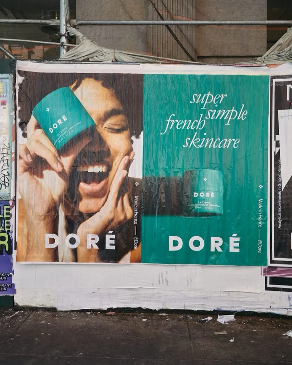
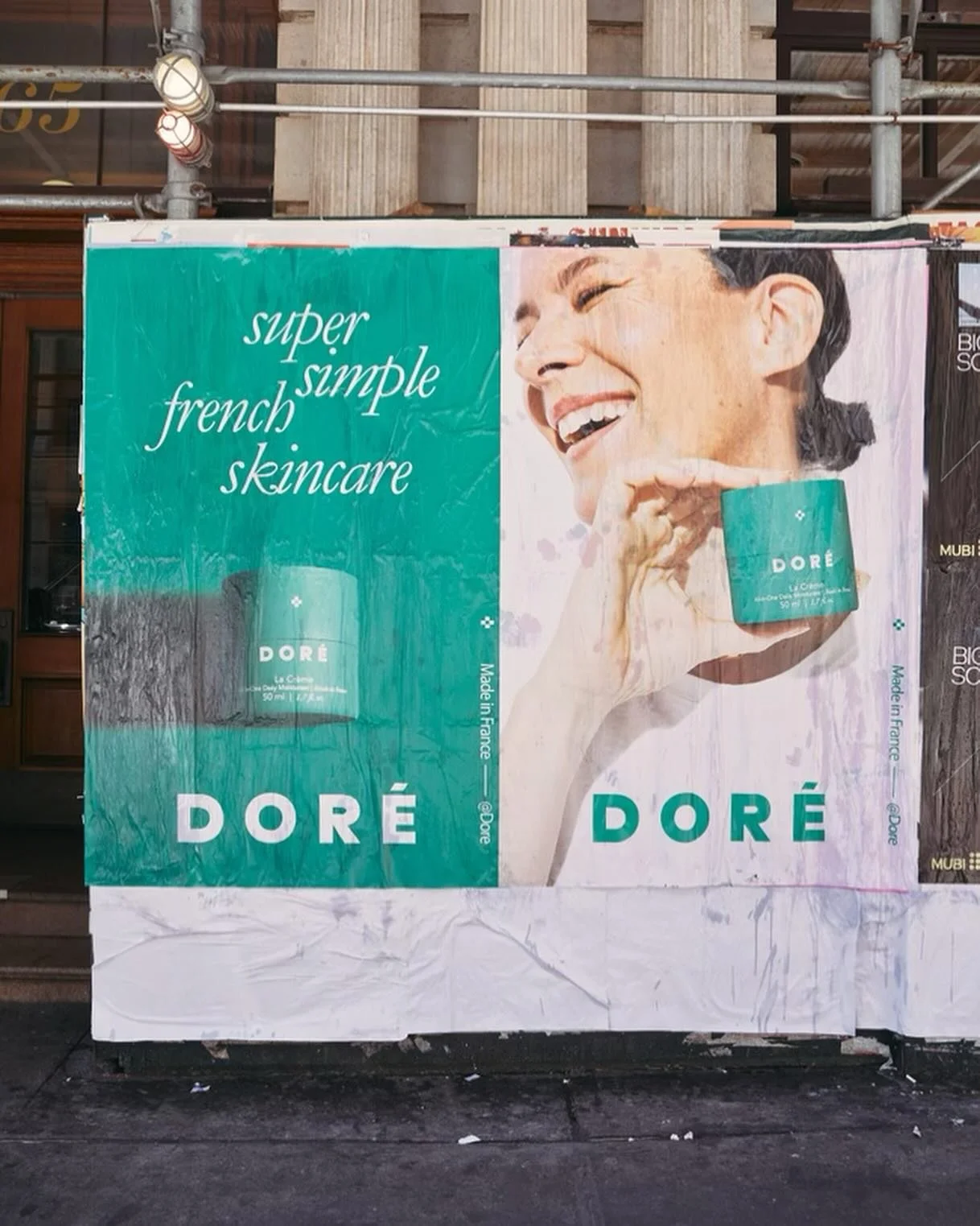
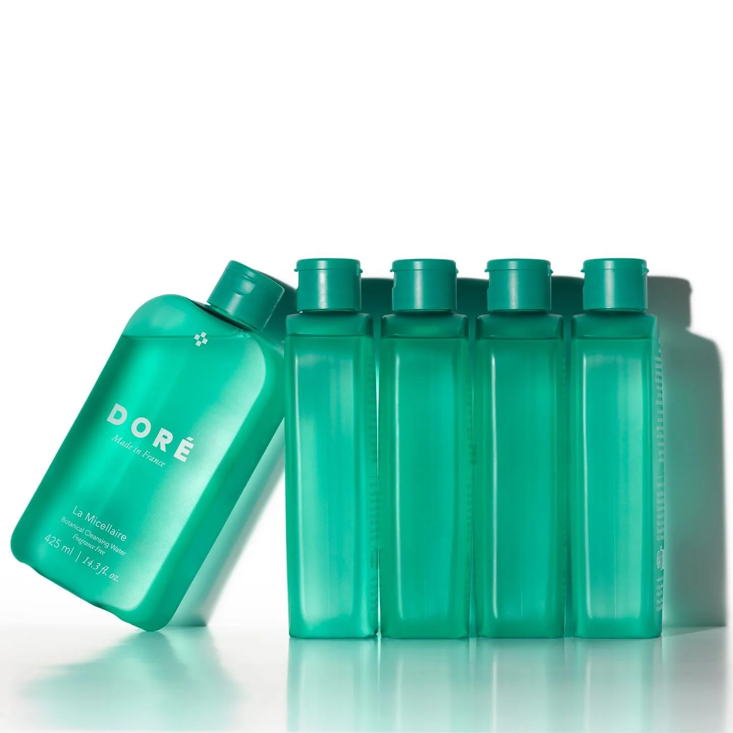
Doré is a French skincare brand founded by Garance Doré and Emily Yeston, built on the belief that skincare should be simple, gentle, and effective.
Rooted in the traditions of the French pharmacy, the brand reimagines a category known for its trust and efficacy through a modern, pared-back lens.
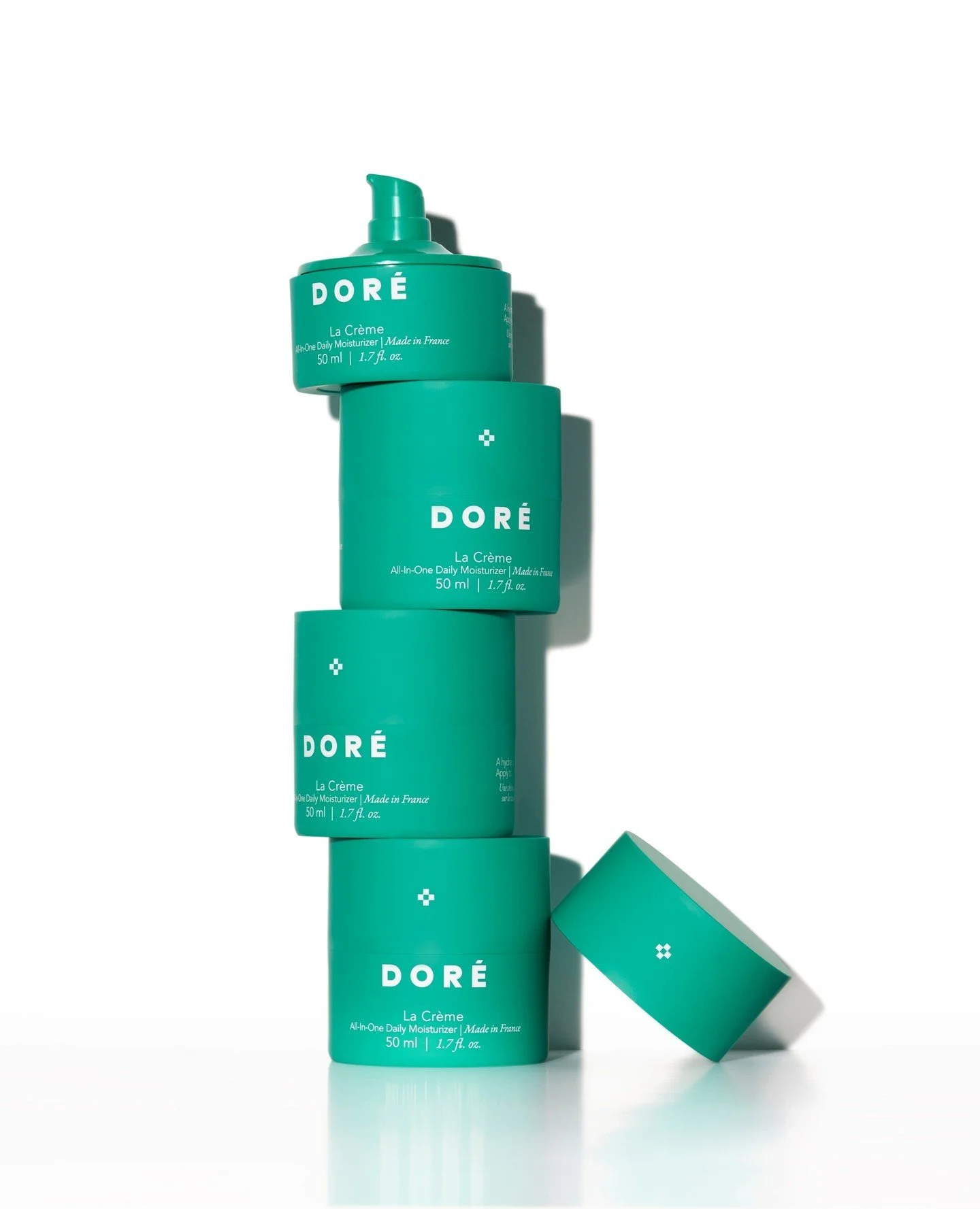
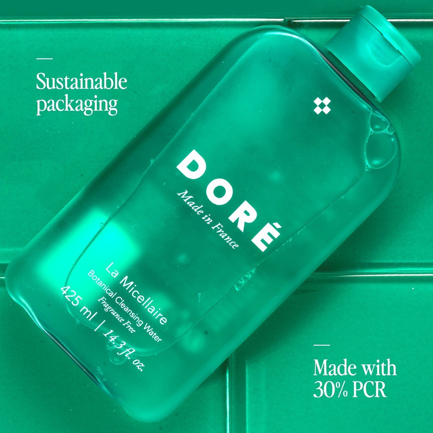
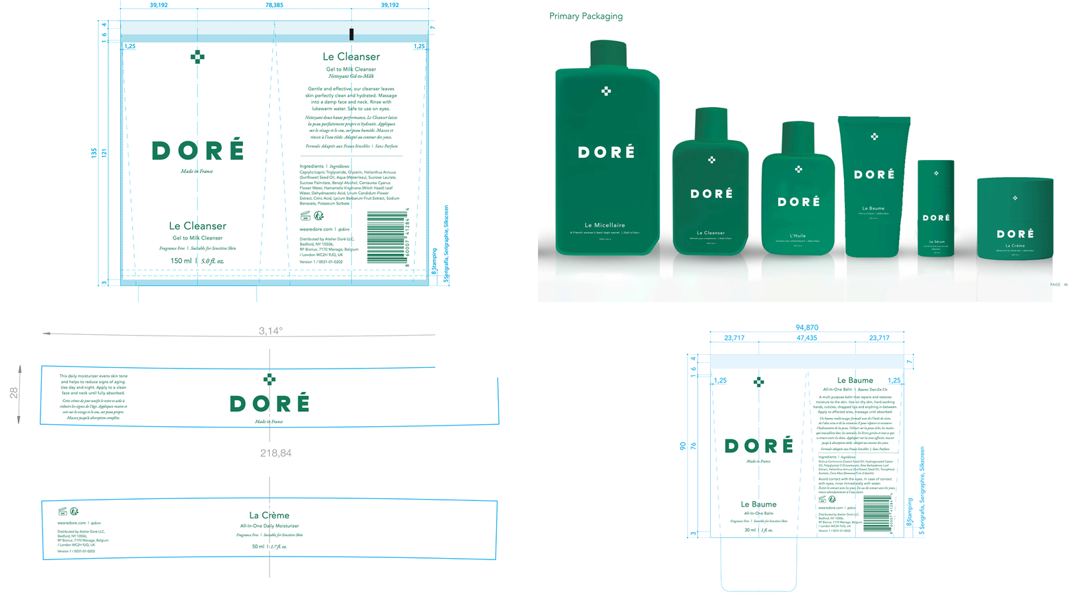
I worked closely with Garance and Emily to shape the visual foundation of Doré from the ground up — developing the brand identity, packaging system, and overall creative direction.
Scope Included
Brand Book
Brand Identity
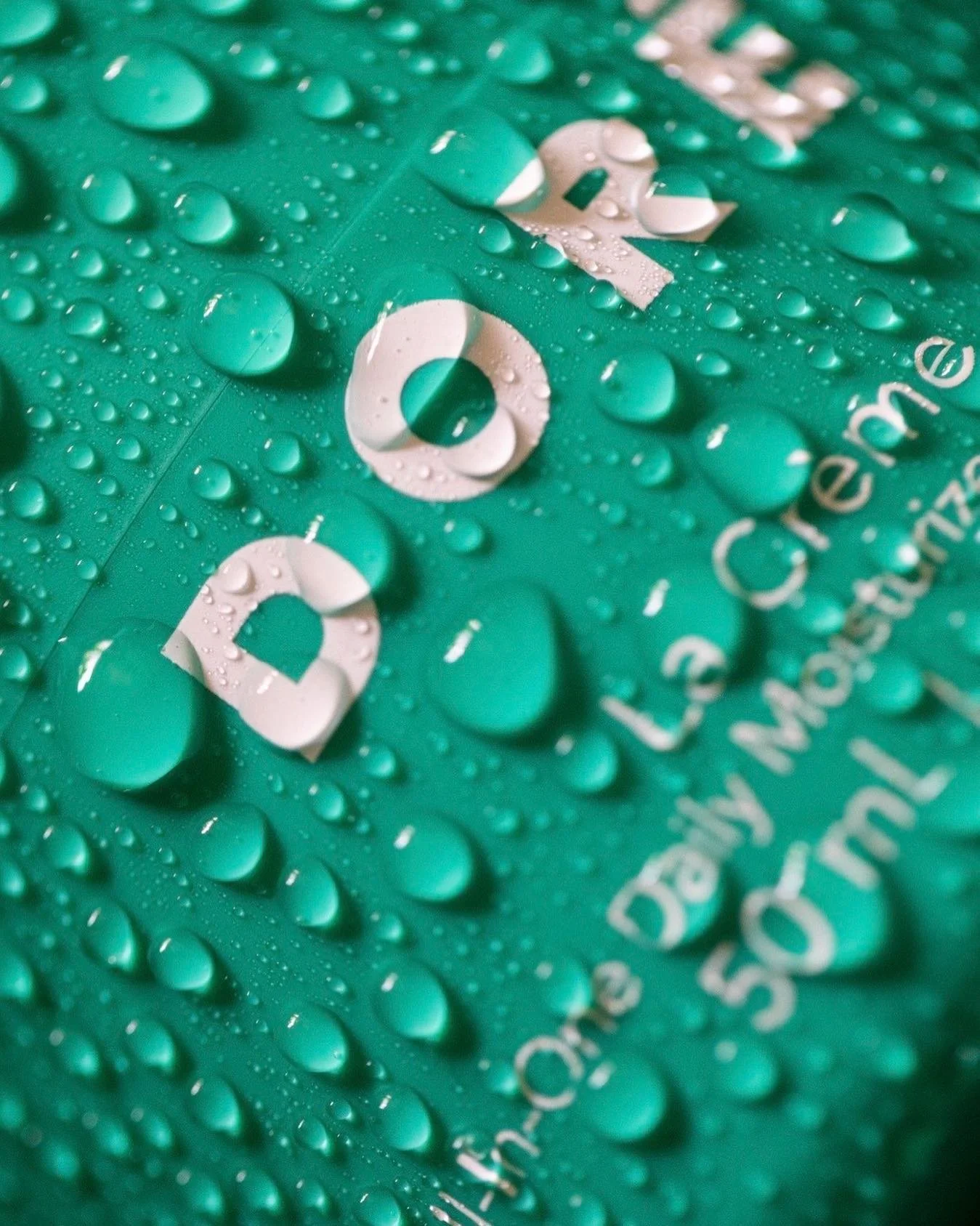
Packaging Design
Art Direction

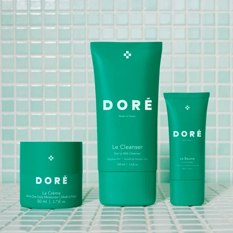

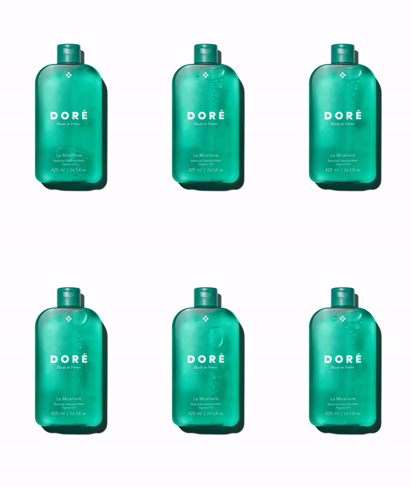
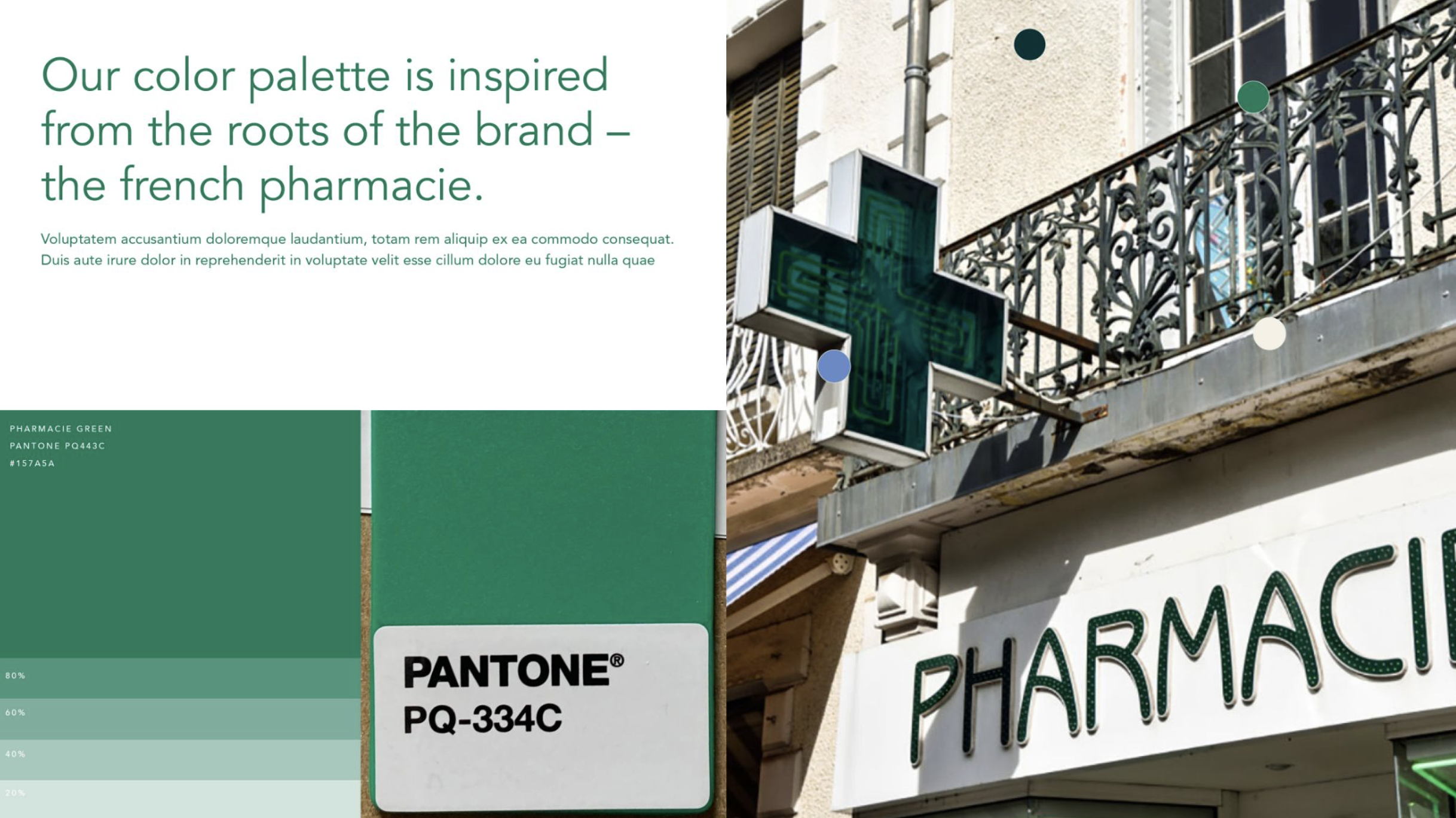
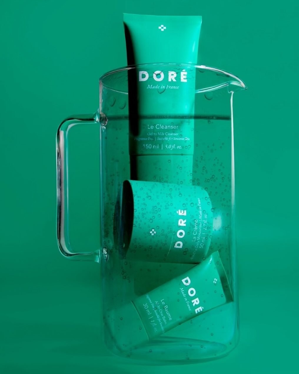
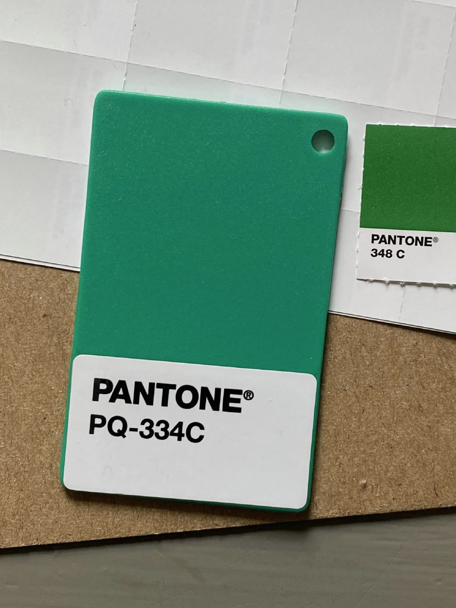
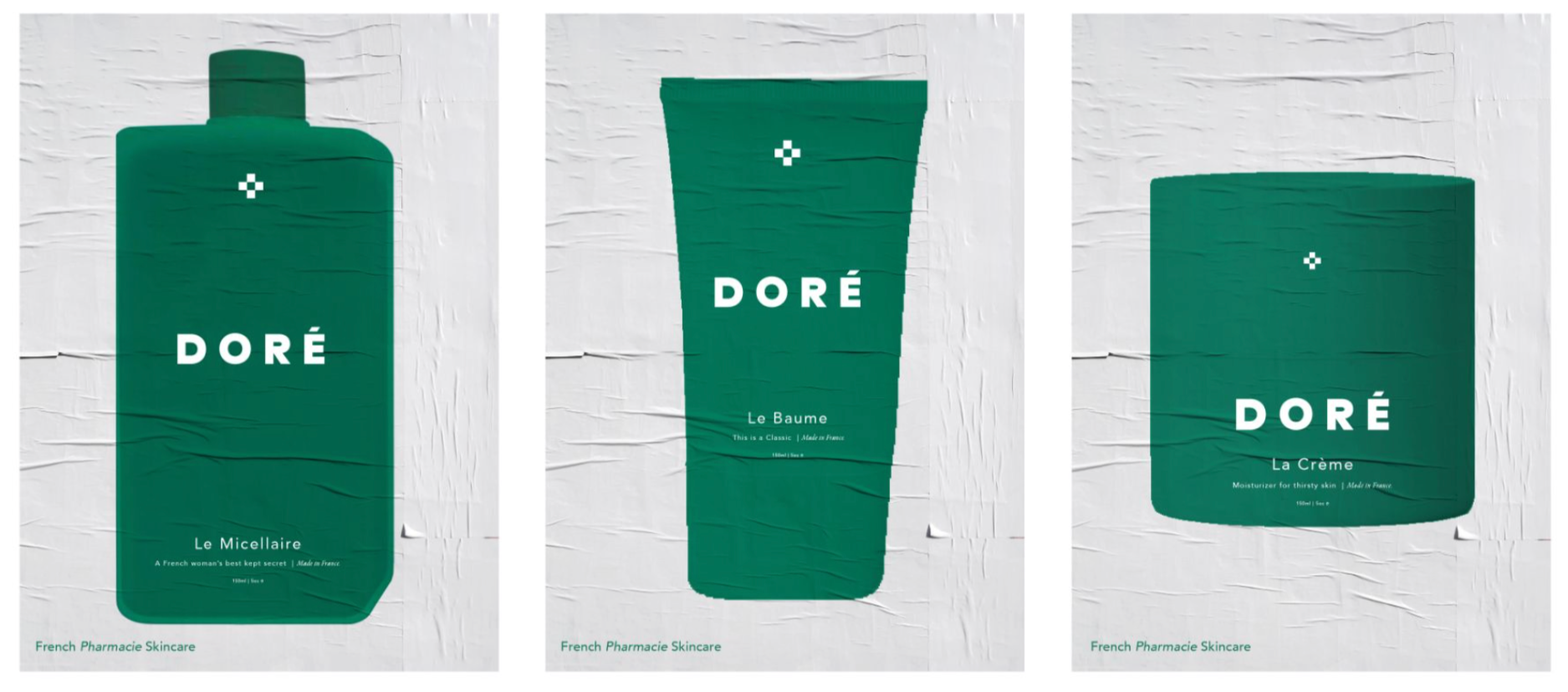
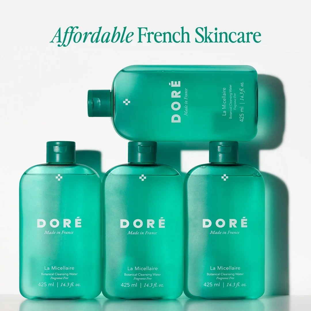
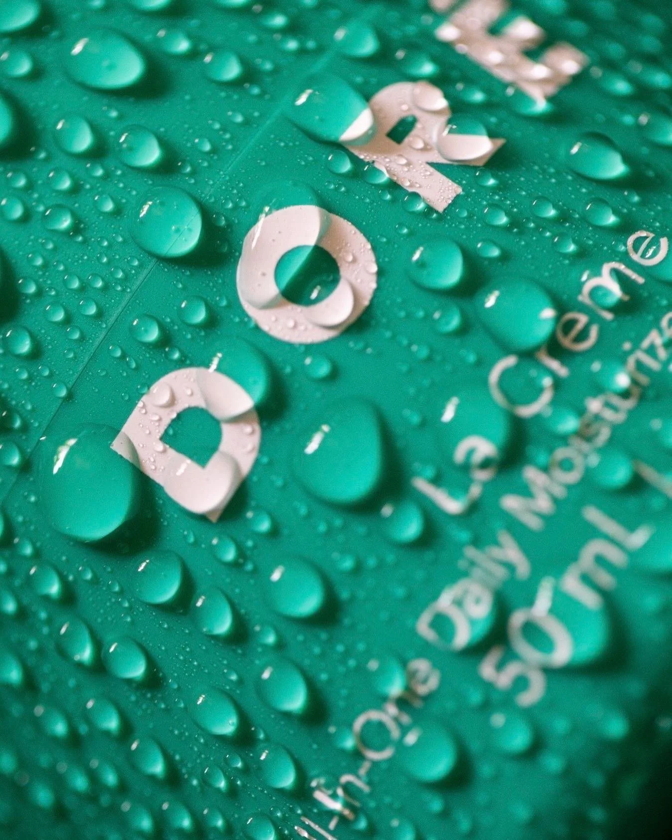
“Green is a color that Garance and I have always gravitated toward, but we loved this green in particular—which Garance really pushed for in the brand development process—because of its vibrancy, and its evocation of nature and also as a nod to the green of French pharmacies. This green was the perfect embodiment of the boldness of Doré.
—Emily Yeston co-founder of Doré

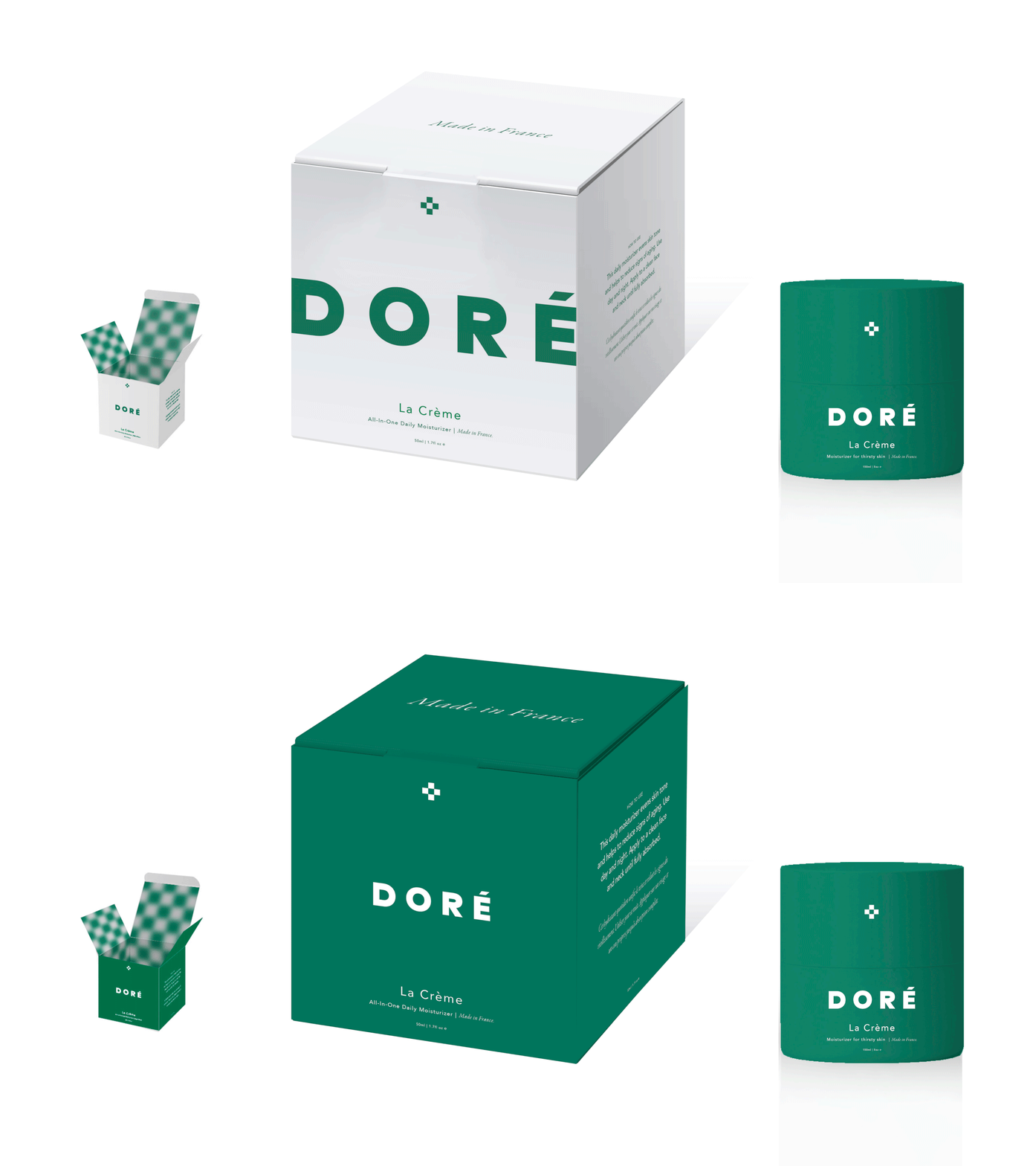
Concept Exploration for Box Design
Multiple iterations were explored to ensure the system could scale seamlessly across all SKUs. A considered balance of structure and graphic clarity, with a signature checkerboard interior introducing a subtle brand moment.
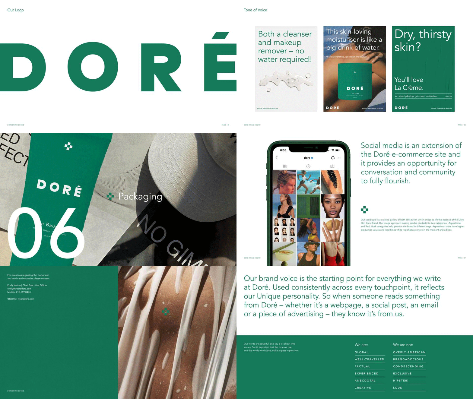
Following an extensive brand development process, I distilled the system into a master brand book — capturing tone of voice, visual language, typography, and packaging. It serves as the blueprint for Doré, ensuring a cohesive and consistent expression across every touchpoint.
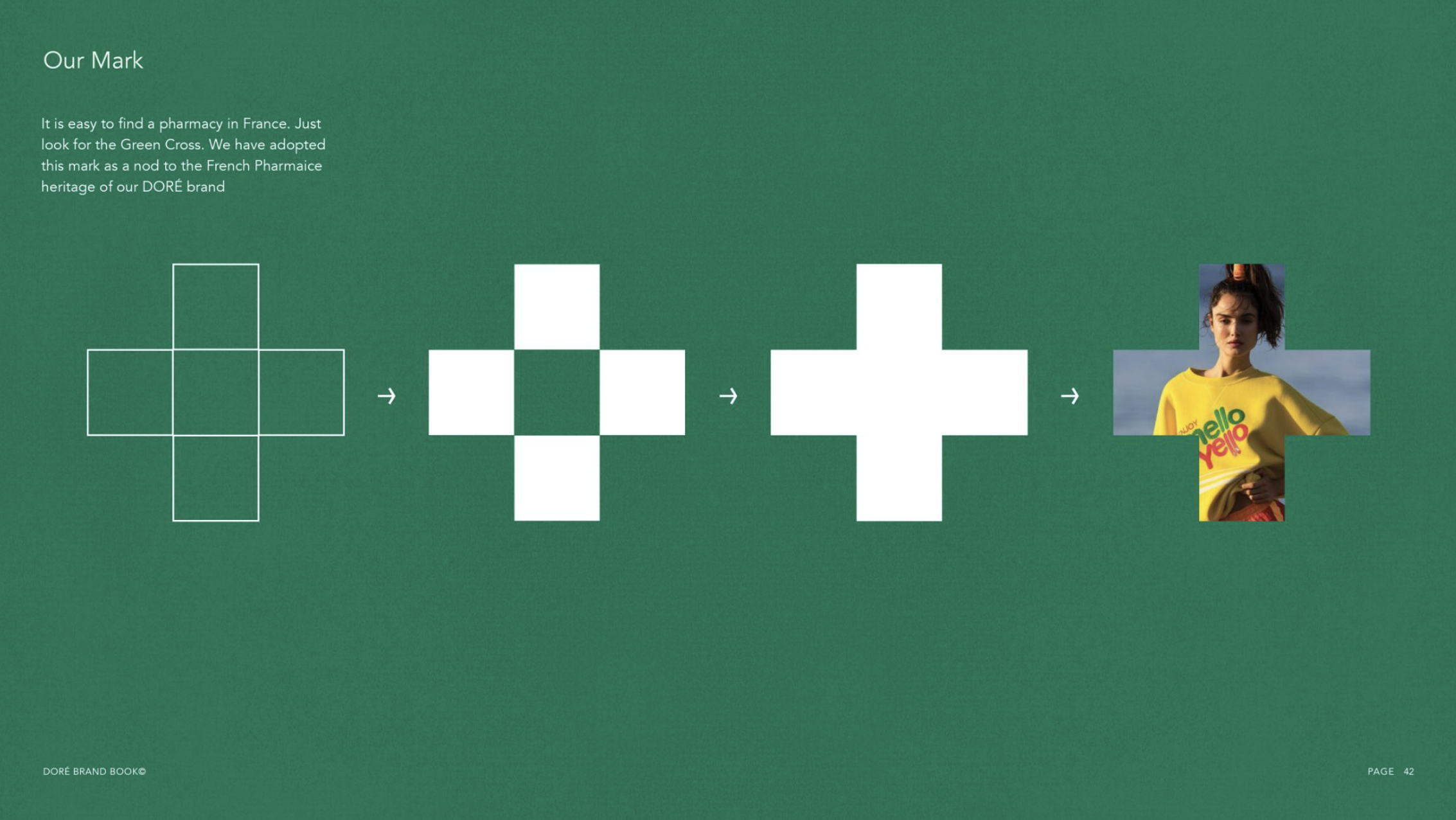
In France, pharmacies are instantly recognisable by their green cross. We reinterpreted this iconic symbol as a subtle nod to Doré’s French pharmacy heritage. The cross became a foundational element of the identity—used as a mark across packaging, and extended as a framing device to hold imagery, creating a cohesive yet flexible visual system.

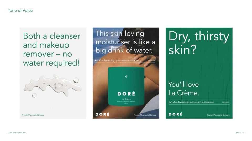
Together with Emily and Garance, we defined a core set of brand values to anchor the identity — embedded within the brand book and used as a strategic lens to guide tone of voice, art direction, visual language, and overall creative expression.
Together with Emily and Garance, we defined a core set of brand values to anchor the identity — embedded within the brand book and used as a strategic lens to guide tone of voice, art direction, visual language, and overall creative expression.
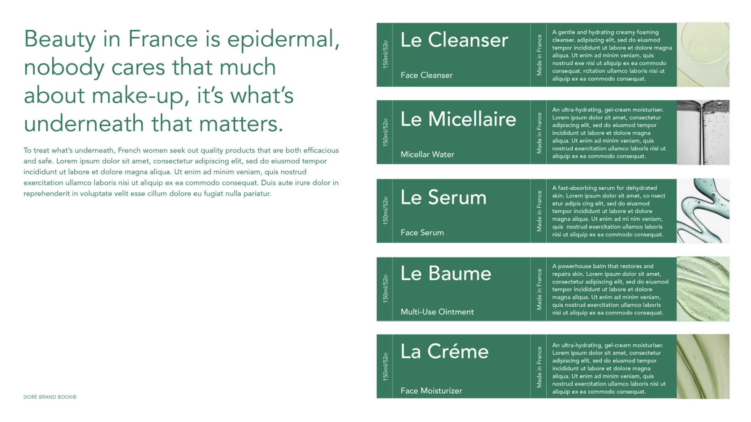
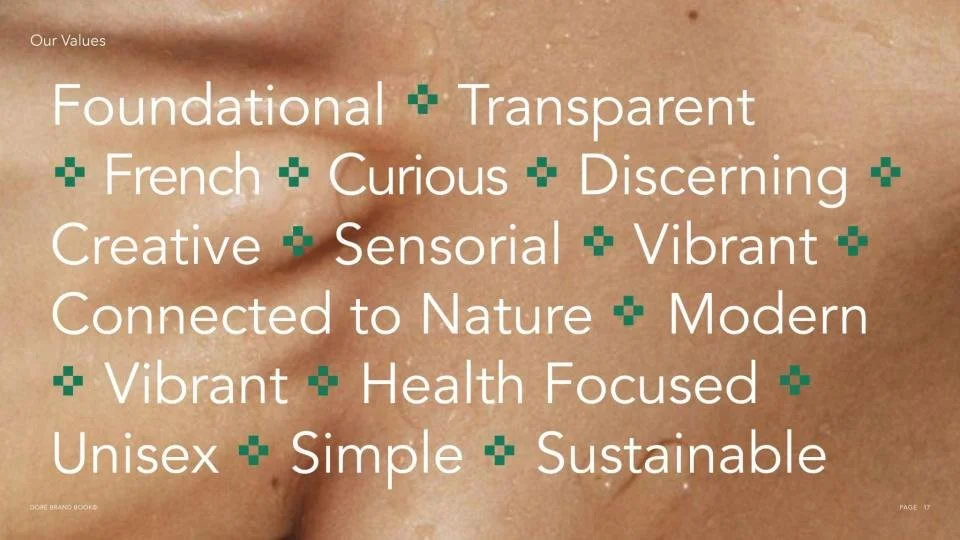
Together with Emily and Garance, we defined a core set of brand values to anchor the identity — embedded within the brand book and used as a strategic lens to guide tone of voice, art direction, visual language, and overall creative expression.